
Union Street Sandwich Company
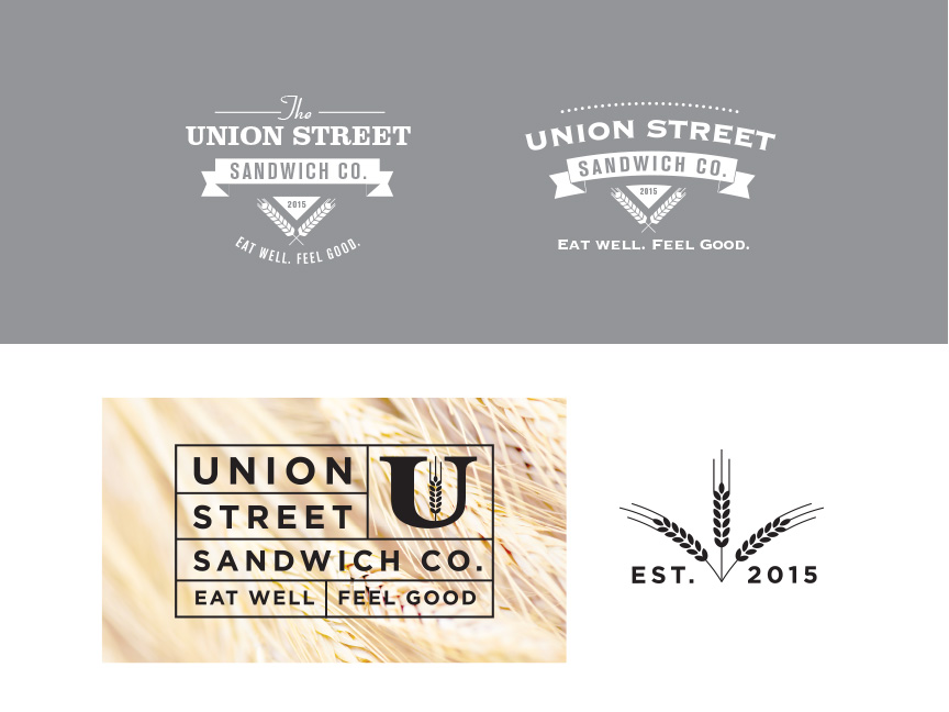
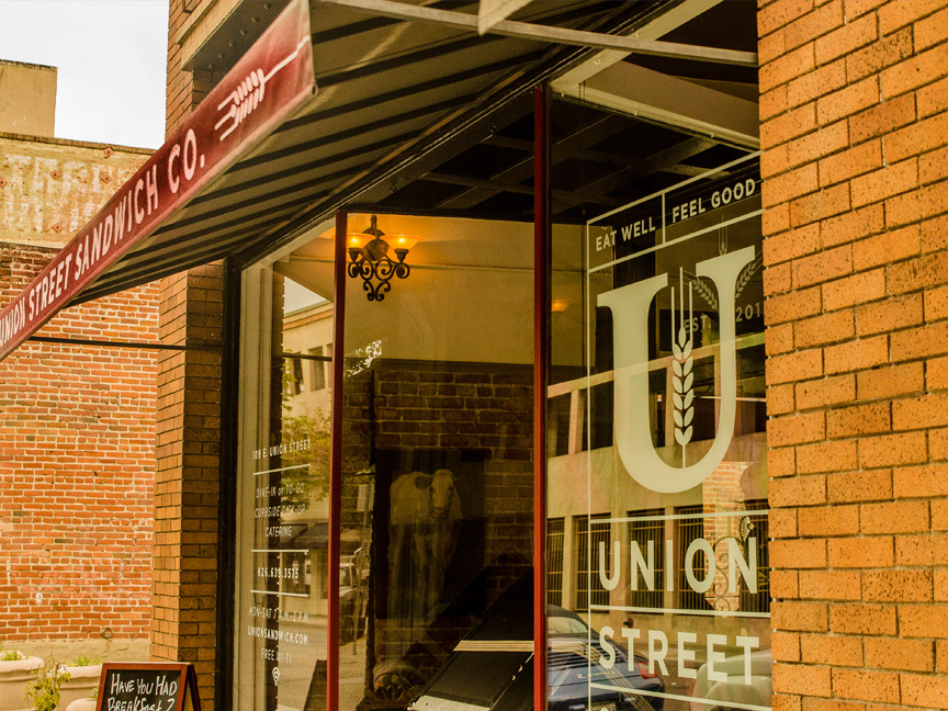
We felt like some of the solutions were just a little “too retro”. I made some stylized wheat stalks that were included in a lot of the versions and married it with the letterform. This was nice since we wanted something that could stand just as a simple mark, and the blocking of all the type elements together resulted in a more current look. The EST. 2015 was made as a supplement element used on the menu, business card and over the front door.

